High quality pictures make a good impression, so you should pay particular attention to taking them. Here are some tips.
Composition

Compose your pictures carefully. The beam of light is the focal point of this picture.
The people add to the picture’s composition, not distract from it.
The important concept here is that you want to draw people’s attention to an object in the picture. Because the people are looking at the light, your attention is drawn to it. The picture would be very different if the people were facing the camera.
Perspective
If you are taking pictures of people, lower your camera (bend down) so that your camera is at chest height, not at the height you would be at if you were standing up.
This is the trick that wedding photographers use to take attractive people pictures.
Resolution
Take low resolution pictures. That’s right, low resolution. Taking pictures for websites is different from taking pictures used to make prints. Website pictures are generally limited to 72dpi (dots per inch). This means that even a 640 x 480 picture is fairly large.
The object is to take pictures at the size they will be used on your website. If you take larger pictures, the image will be scaled after it is delivered to the browser. This means that you are slowing down your website by sending larger pictures than are necessary.
In most cases, you can probably set your camera for as low as 1280 x 960 pixels or equivalent. As a guide, the pictures on this page are only 300 x 225.
You can also edit your pictures so they are the exact size needed on your web page, and then upload them. Consider compressing them as well if they are JPEG (.jpg) images. If you need a free and very capable photo editor, try https://www.getpaint.net/
Lighting

Make sure the pictures are well-lit. Generally, avoid the use of flash unless it is used as fill-in flash. The main source of lighting should not be behind the subject (e.g. a bright window behind the subject). You do not want dark pictures with low contrast.
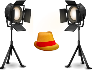
For product pictures, You should use fairly intense lighting on your subject. This forces the camera to use a small aperture so that all portions of the product are in focus. For a simple setup, you can buy two identical halogen or LED desk lamps with 50 watt bulbs or equivalent. Place the light sources on the left and right sides of your product at about 60 degrees from the front.
A diffuse light source gives better results, as it eliminates harsh shadows. If you would like a professional setup, consider purchasing a light tent. You may find these at B&H Photo and other suppliers.
Focus and Composition
All digital cameras take pictures that are in focus, but is the focus on what you want? If you are taking a photo of a person, you may want the background to be out of focus so that it is not distracting. Avoid taking long-distance shots of groups of people. Nobody is going to look at their feet. Take close-ups.
For example, let’s say you have a store. A picture of the storefront or an interior isle might be nice, but also take close-ups of individual counters, wall displays, and racks so that visitors can clearly see the kinds of merchandise you offer.
Camera Color Temperature Setting
Regardless of what kind of pictures you take, the camera should be set to match the color temperature of the light source.
Do not depend on your camera to select this automatically.
You should manually set your camera to the color temperature of the light source you are using so that colors are accurate. i.e. Sunlight, Cloudy, Incandescent, Fluorescent, etc. All good cameras have such settings. If you are using LED bulbs, the color temperature is stated on the box. You may find more information on color temperature at this website.
Background Mats
If you are building your own setup, go to an office supply store and buy two 20 x 30 inch foam display boards, commonly used in sales booths and office presentations. Choose a medium grey (works for all) or perhaps dark blue (unless your product is blue). White may not be a good choice because then the brightest part of your picture will likely be the background.
Prop up one board vertically against the other which should be horizontal. Now you have a grey bottom surface to place your product on, and you also have a grey background.
Product Positioning – Use a Tripod
You should use a tripod. The lens should be at the same height as middle of the object. If you hold the camera in your hand, one picture may be focused on the top, one far away, one too close, one to the side, etc. You want product pictures to be consistent.
Mark the exact spot on the bottom mat where each product should be placed, then take your pictures. This way, pictures of three products that may come in different colors come out exactly the same except for just the color.
Watch Your Shutter Speed
Even if you are using a tripod, do not let your shutter speed get too low. If the shutter speed drops below 1/60th of a second, there is a possibility the image will come out blurry. A low shutter speed indicates that your lights are not bright enough, or, that you are shooting with a camera that does not have a big enough aperture.
Cropping
Do NOT tightly crop the picture. The product should be in the center of the frame with some background color visible on all sides.

